
These are two of the pictures i used within my magazine, i have left comments on each one explaining why i used them and why i felt they fit in better with my genre of music and target audience than my previous orignial images.

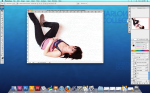


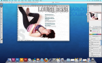

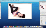


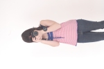
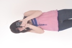
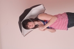

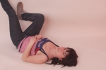
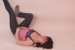
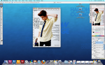
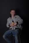
These are some of the original images that i took of louise, for my magazine, although i have no used all of them in my magazine i wanted to show them on my blog as proof that i took these pictures myself. I have left a comment on the picture i wanted to use explaining why i chose to use that certain one.


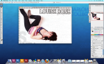
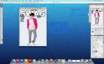
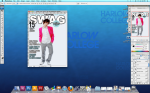
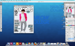
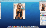
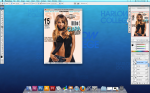
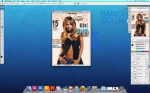
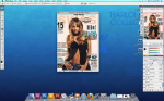
My contents page was easier too make as i already decided before creating it that i didn’t want to over run the page with writing, i just wanted a picture a few bits of relevant text so my target audience wouldn’t get confussed between my front cover and my contents page. however i wanted to make the word ‘contents’ bigger than the rest to allow the reader to know what page this is. As you can see i have taken numerous print screens of different stages of the production of my contents page and have left comments on each print screen explaining what i did and why i chose to do it.


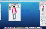


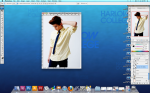
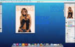
After looking at my other front cover I put in my original images to complete it, however once I had put my pictures in I realized they did not go with my colour scheme so I decided to make some minor changes to the text colours, and background. My background is now a light blue and all text is now either blue, white or black and I don’t think the pink worked well once my pictures had been entered. All the changes can be seen in the screen grabs i have made, i have also commented on each one with a step by step guide to what I did during each one and why.


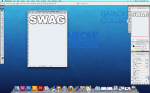
I created thing as my front cover, only using a picture off google which i was going to replace with my own. I did not use this as my final cover, making minor changes to it, which i will explain.
I have taken screen shots to show step by step how i created it, and i have also added commens to each picture explaining how i done this and why i done it.

I have created this mock up of a front cover to gather my rough ideas of the type of text, colours and general layout i may want to use in my real cover. I like the colour scheme i have used continously throughout the cover however i think that they are too dark and dull and may not stand out enough for my chosen target audience. I like the layout of this mock and will hopefully use the same one for my real cover.
I have used to same text as my previous mock up for the preliminary task as this was not an issue whilst producing the mock up, therefore the text and picture will not be used through my final drafts as that would be plagiarism against other magazines.
My critisims about the mock was that i have already taken images for my magazine and decided they didn’t work, so therefore creating a mock up with the same colours and text as i was previously hoping to use has emphasized on my decision that i need to make my conver more colourful and bolder so the certain genre of music is put across my magazine better, and i hope to attract my chosen target audience.


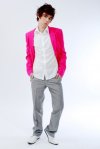
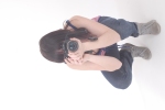
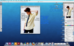
I took a few original pictures which i thought i would use as my front cover and some for my double page spread however after thinking about the other aspects of my magazine such as the text fonts and colours, i realised the picture doesn’t fit in with my magazine and doesn’t represent my genre of music as well as i had hoped. I may still use some of these pictures within my magazine however i have decided to some different pictures for my front cover and contents page that fit my target audience better.
I have posted comments on a few of these pictures explaining why i didn’t want to use them for my cover, etc.
 Vibe magazine is another one i looked at which has personally influenced my work a lot more than other magazines. The genre of music that this magazine portrays is the type i am hoping to use in my own magazine therefore researching into this magazine and its contents would be really helpful to gather information on how to make my own one. Although this magazine cover i have chosen to look at doesn’t attract girls, other covers previously produced by this magazine show they’re target audience is for both girls.
I like everything about this cover and the rest of the covers this magazine uses, for example all the text used is bold and outstanding and really helps make the magazine eye catching and understandable for the reader. The pictures they use are relatable to the genre of music and linked to the contents inside this issue and the colours they use fit in really well with the magazine and aren’t always matching, which stands out againsts the backgrounds used. The magazine isn’t overun with irelevant text and has short stories about what is held within the magazine to draw in the reader.
This magazine has helped me focus on certain aspects i need to include in my own magazine.
 I looked at XXL magazine because it portrays the same genre of music i like listening to however there are hardly any covers for this magazine with girls on them which shows the magazines target audience may be focussing on men rather than women here, however my magazine is based around both genders.
The style and layout of this layout is really good in achieving its audience. The text is also a good font which i need to consider when producing my own magazine too. I like this magazine as it is not overflowed with information on the front cover and shows a generally nice look to it which attracts the reader to it. I need to consider all these aspects when doing my own magazine so looking at more magazine covers for this certain magazine may help me.
I think it would be helpful and useful to research further into this magazine as more information about the production of music magazines may be of use to me when considering how i am going to achieve my targets, however the target audience for this certain magazine is not nessessarily the same as mine so another magazine may suit my research better.
