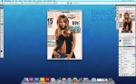
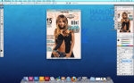
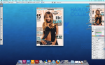
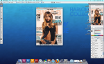
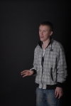
I have created this mock up of a front cover to gather my rough ideas of the type of text, colours and general layout i may want to use in my real cover. I like the colour scheme i have used continously throughout the cover however i think that they are too dark and dull and may not stand out enough for my chosen target audience. I like the layout of this mock and will hopefully use the same one for my real cover.
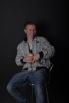
I have used to same text as my previous mock up for the preliminary task as this was not an issue whilst producing the mock up, therefore the text and picture will not be used through my final drafts as that would be plagiarism against other magazines.
My critisims about the mock was that i have already taken images for my magazine and decided they didn’t work, so therefore creating a mock up with the same colours and text as i was previously hoping to use has emphasized on my decision that i need to make my conver more colourful and bolder so the certain genre of music is put across my magazine better, and i hope to attract my chosen target audience.